
In my post last week, I mentioned that company branding is important, and learners like to see consistency from course-to-course. Yet, as a developer this can feel like you are locked in a box. It just may be one of the quickest ways to stifle your creativity!
To break through this prison of corporate branding, I decided to go on a journey through nature’s oceans, jungles, poles, and more to re-ignite my creativity. (A figurative journey, of course – I’m not exactly an adventure junkie!)
Every couple of months, I will select an image of nature and use it as a source of inspiration to create some type of learning product (a template, a learning object, etc.). I’ll post it here along with commentary on how I was inspired.
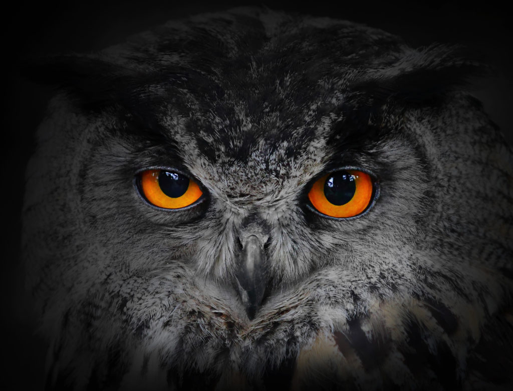
Today’s image is the owl.
For my learning product, I used Storyline to create a template for a button interaction.
The first thing that stood out to me was the contrast in colour of the bright orange eyes and the grey feathers. Then I was struck by the gentle texture of the feathers and the intricate details of the wisps of the feathers. Then I noticed the different surfaces of the shiny eyes, the soft, fluffy feathers, and the dull beak.
Although colour is an obvious choice, I decided to use the striking colour as inspiration anyway. I rarely use such a strong colour, so I was excited to find a way to bring in a bright colour without feeling too 80’s neon. I believe the pop of orange against the dull green and grey feels cheerful and isn’t overwhelming.
I don’t usually use textures, so I enjoyed the challenge of incorporating them without causing cognitive overload. Although the texture in the background is quite obvious, with the opaque grey overlay, it does not distract from the content.
The final aspect I wanted to create was a shine. I was planning to add a faded and transparent white arc over the orange circles to give a bit of a glimmer. Unfortunately, no matter what I did, it didn’t seem to fit with the style and feel that I have chosen for this template. So, I left it out. In retrospect, choosing three aspects of the image for inspiration might have been overkill!